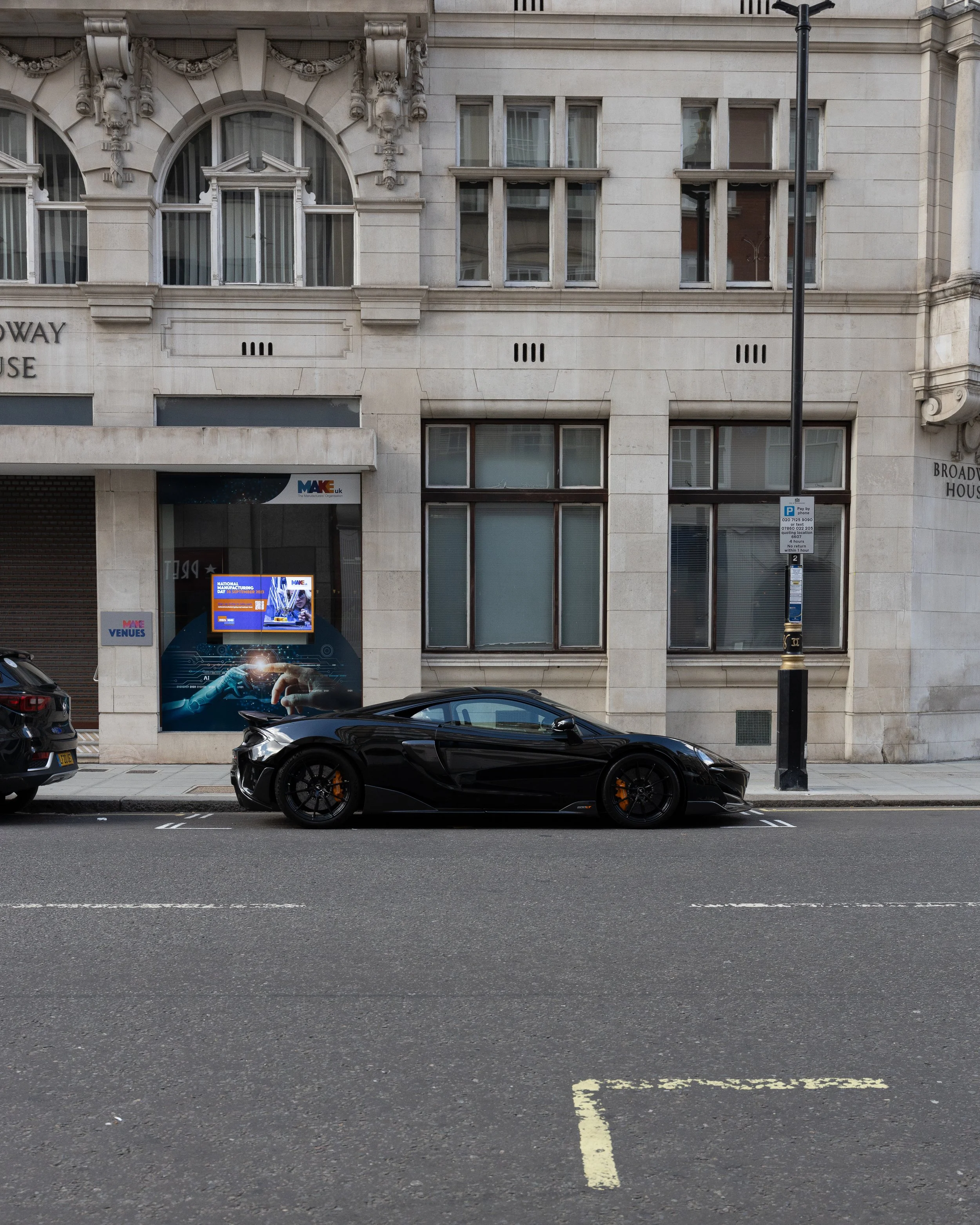
Original image.
The direction with the edits and colours was to create a dark, simplistic, non-distracting composition.
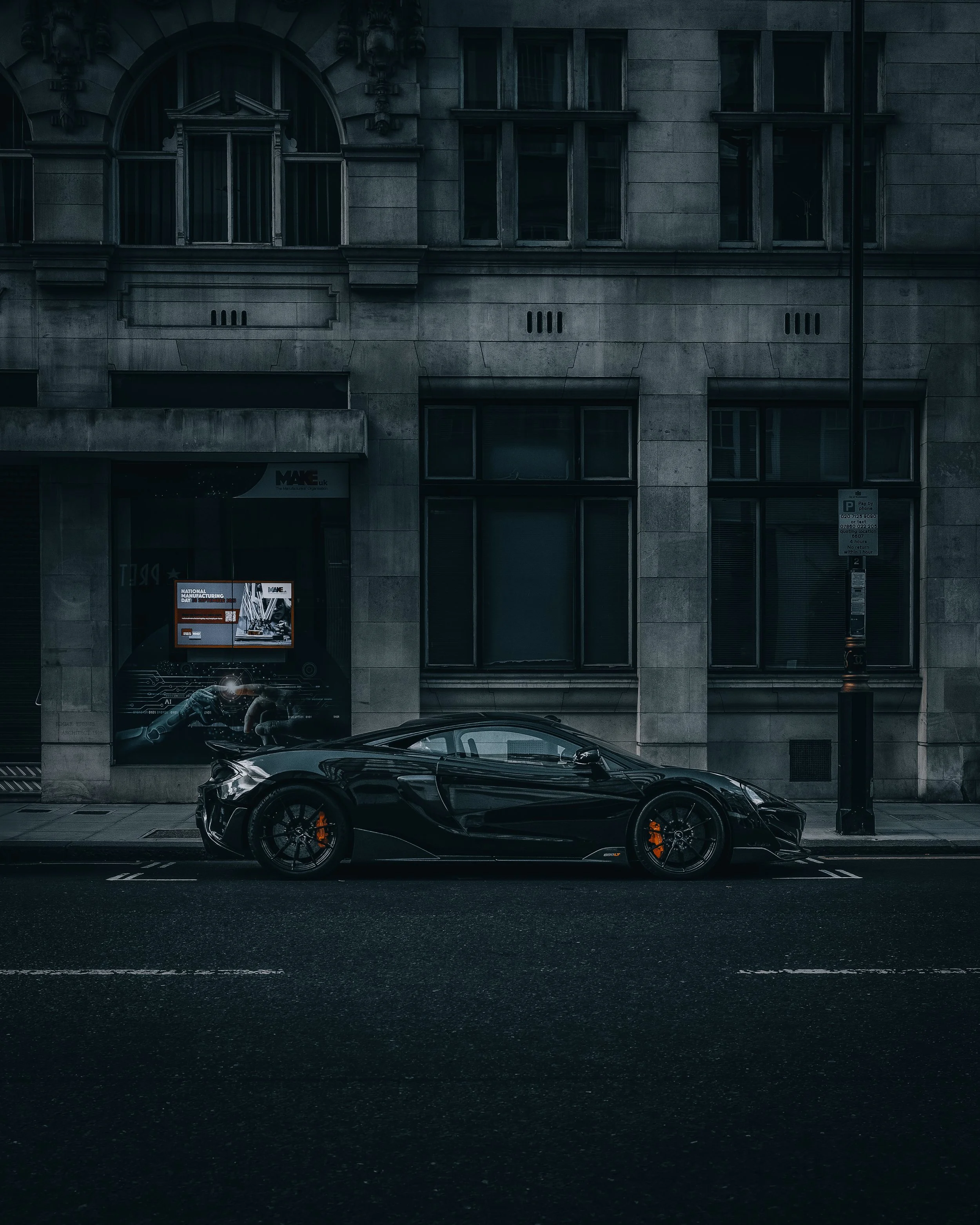
The edited image.
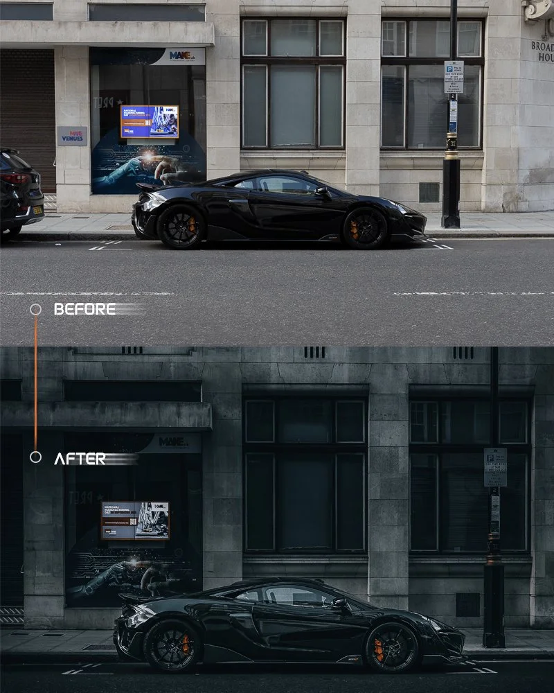
A before and after to show the colour grading difference.
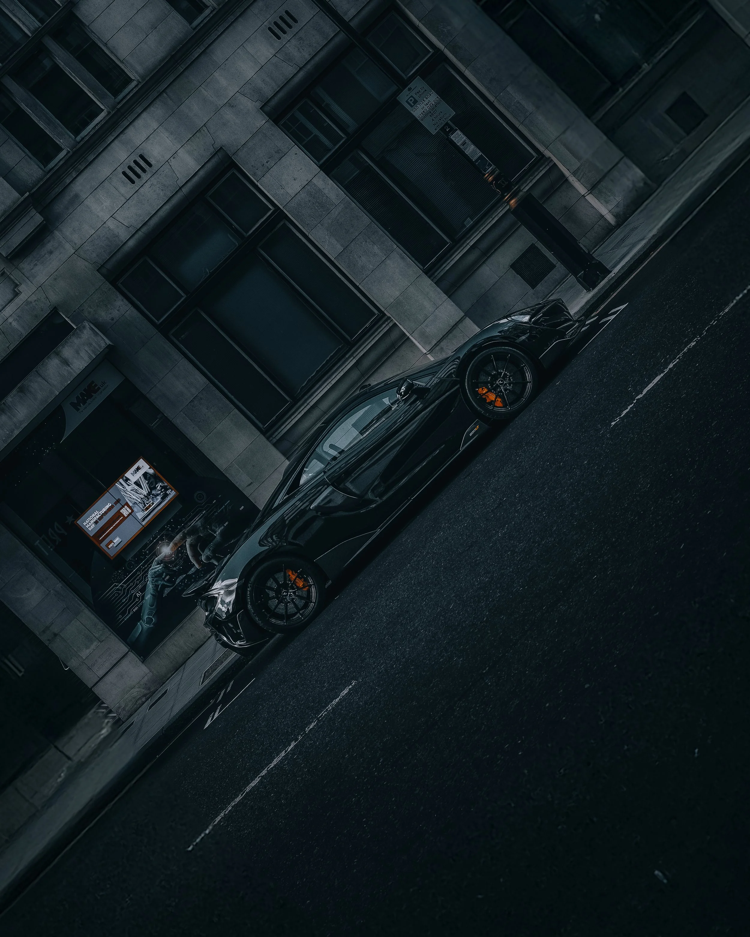
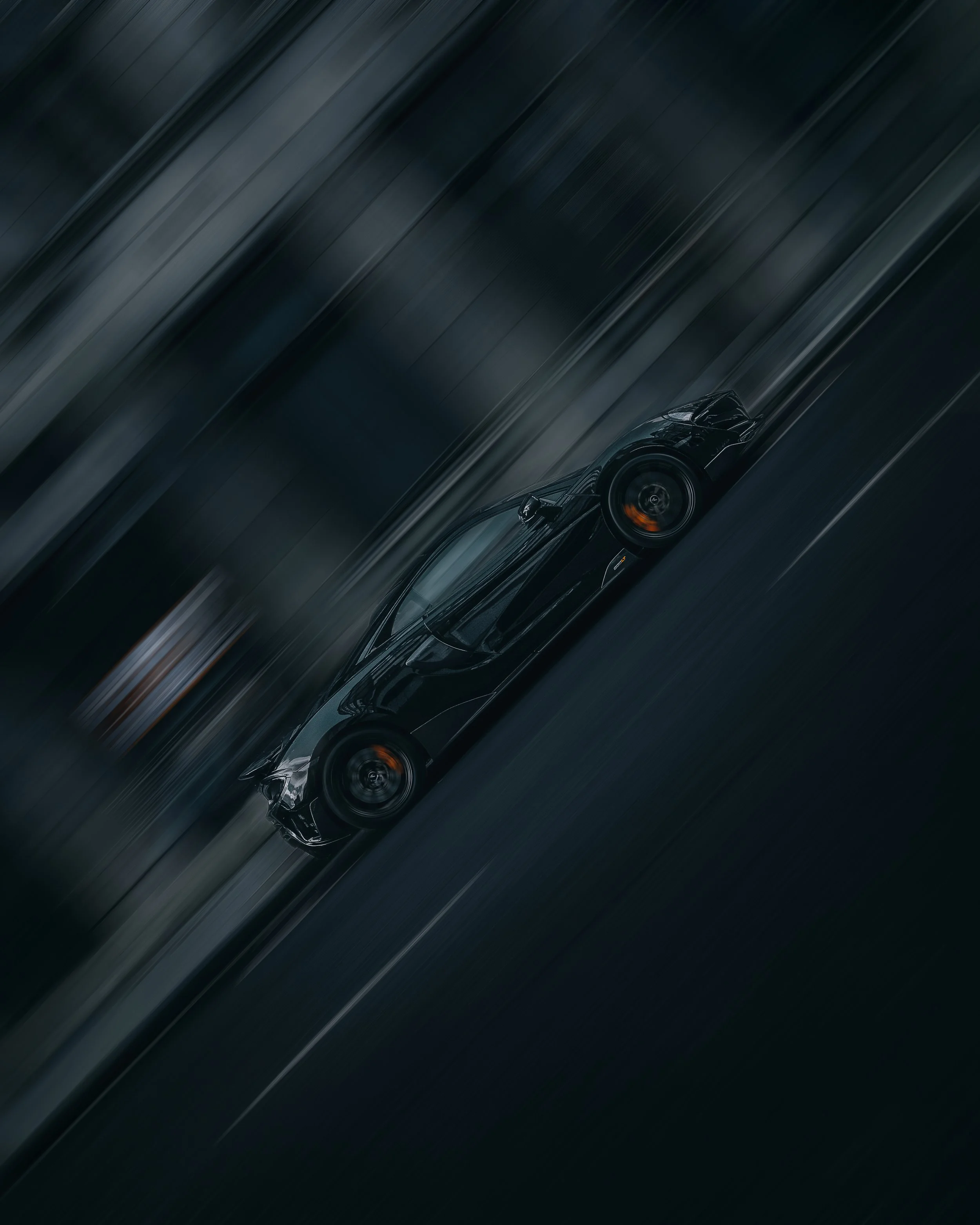
Rotating the image to add a new interest to the perspective.
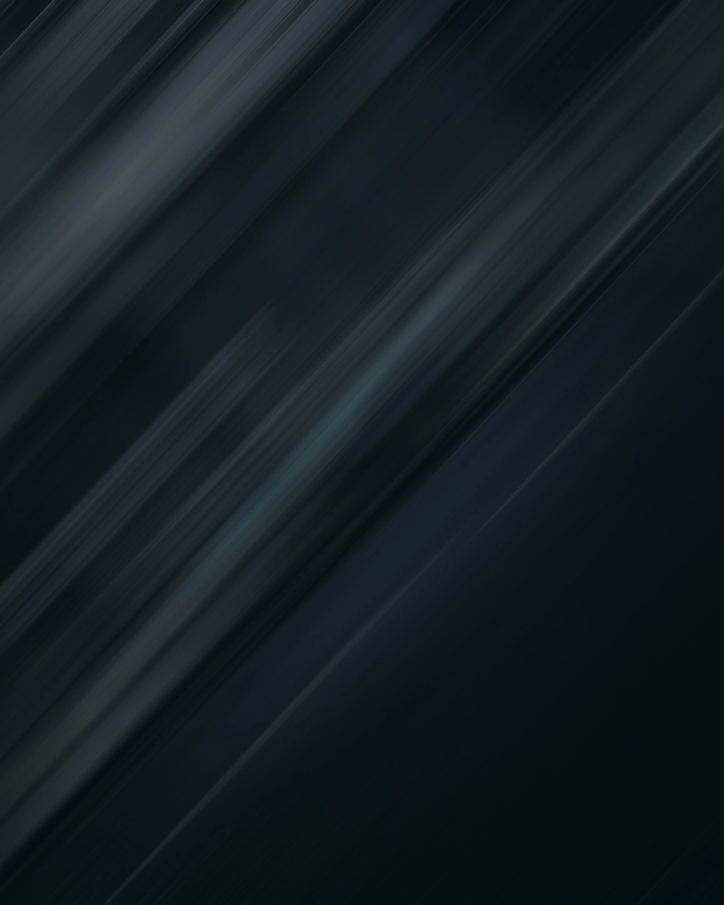
Creating motion on the whole image and selecting parts to be in focus.

The image with the blur effect to add motion to the image.
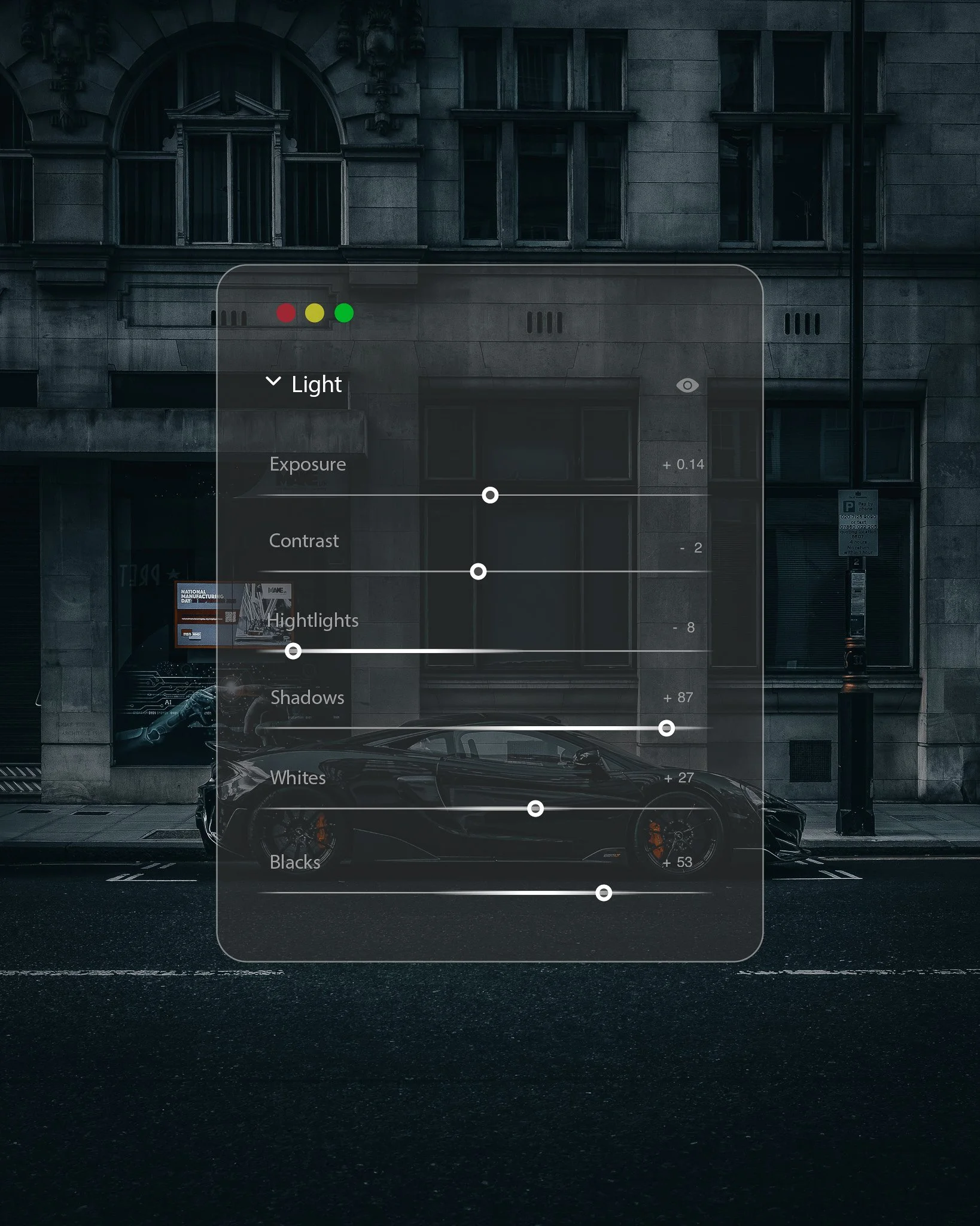
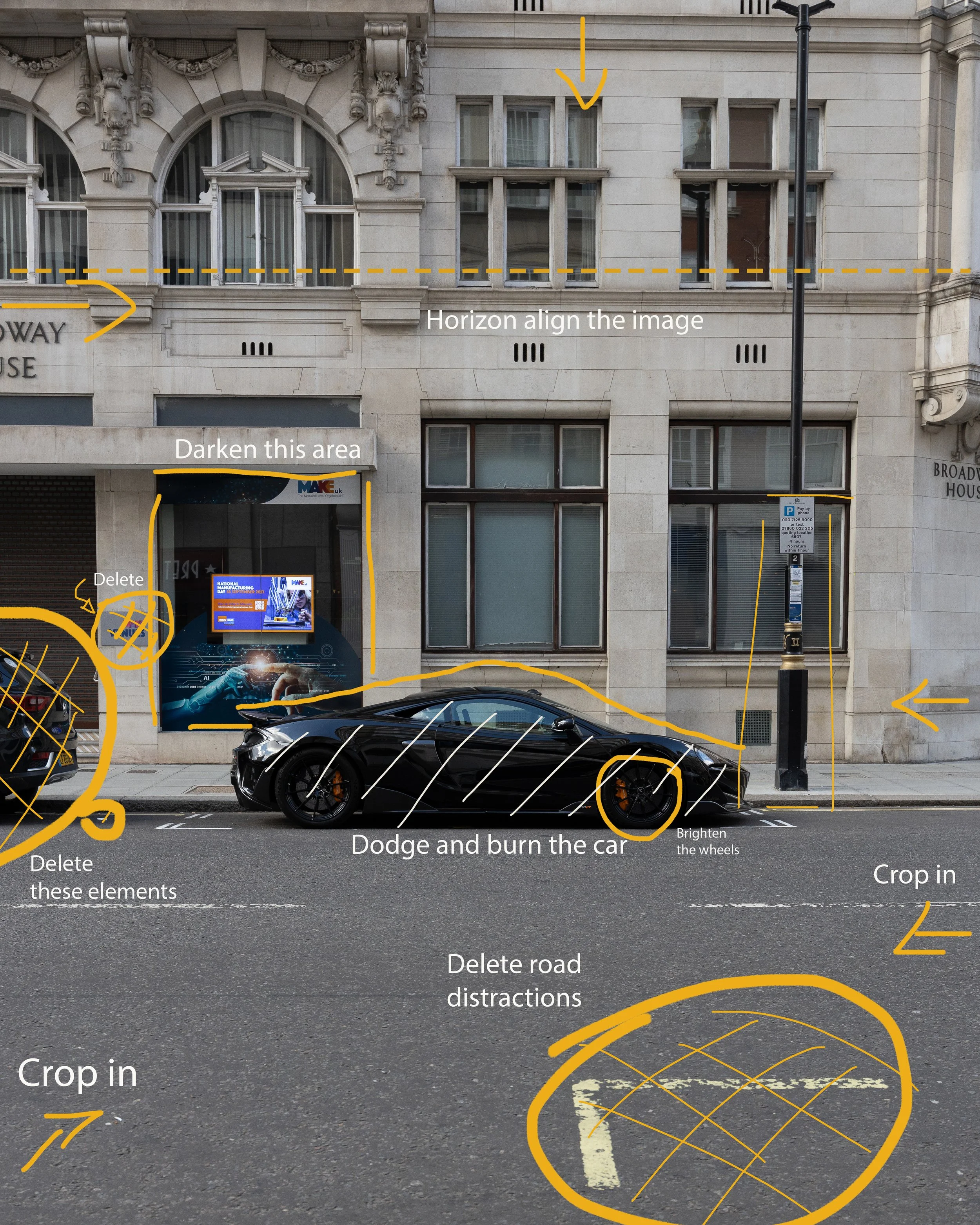
Creating an editing UI element to show some of my edit settings.
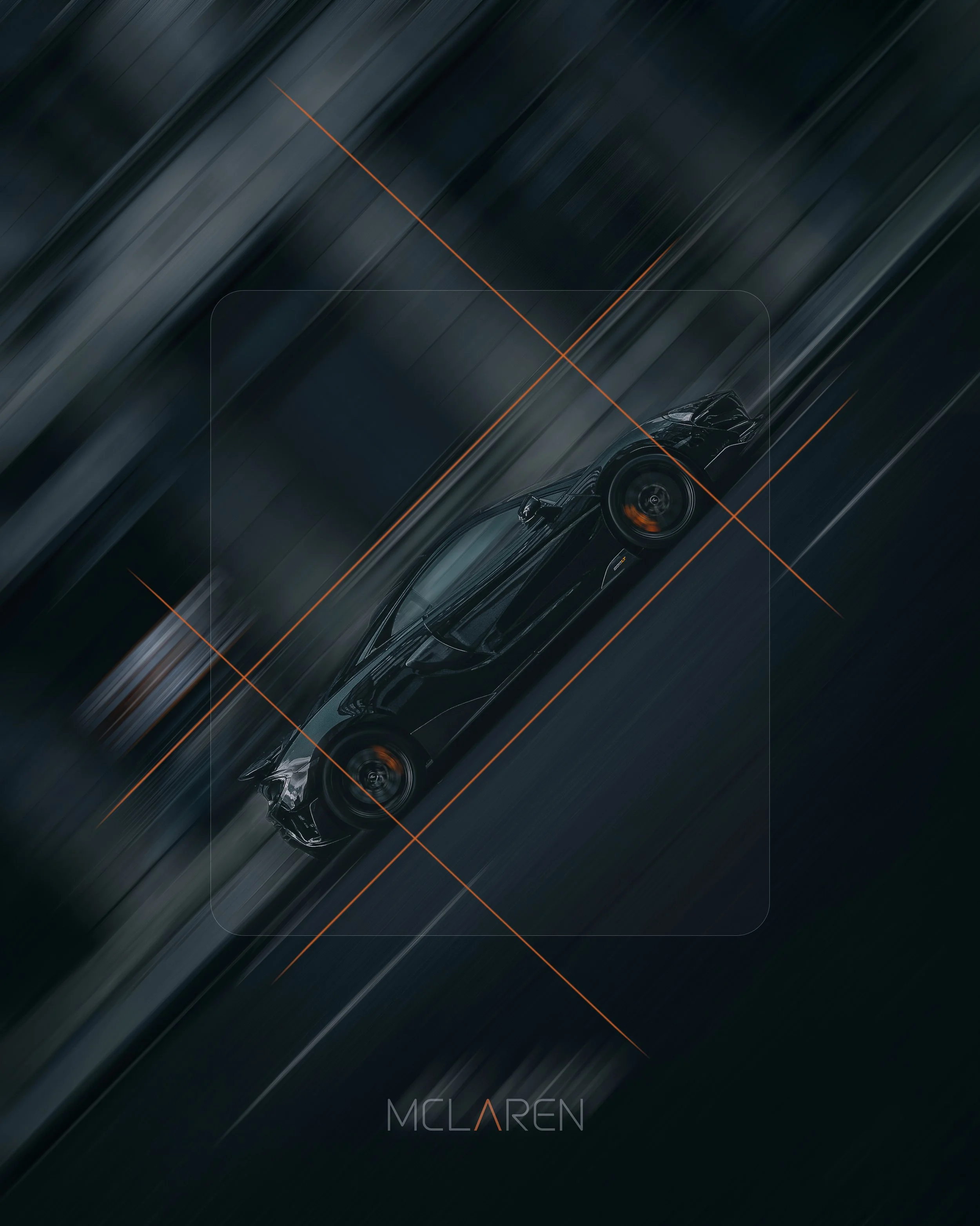
Adding additional designs to the picture to establish branding and adding a grid-like element for aesthetic purposes.
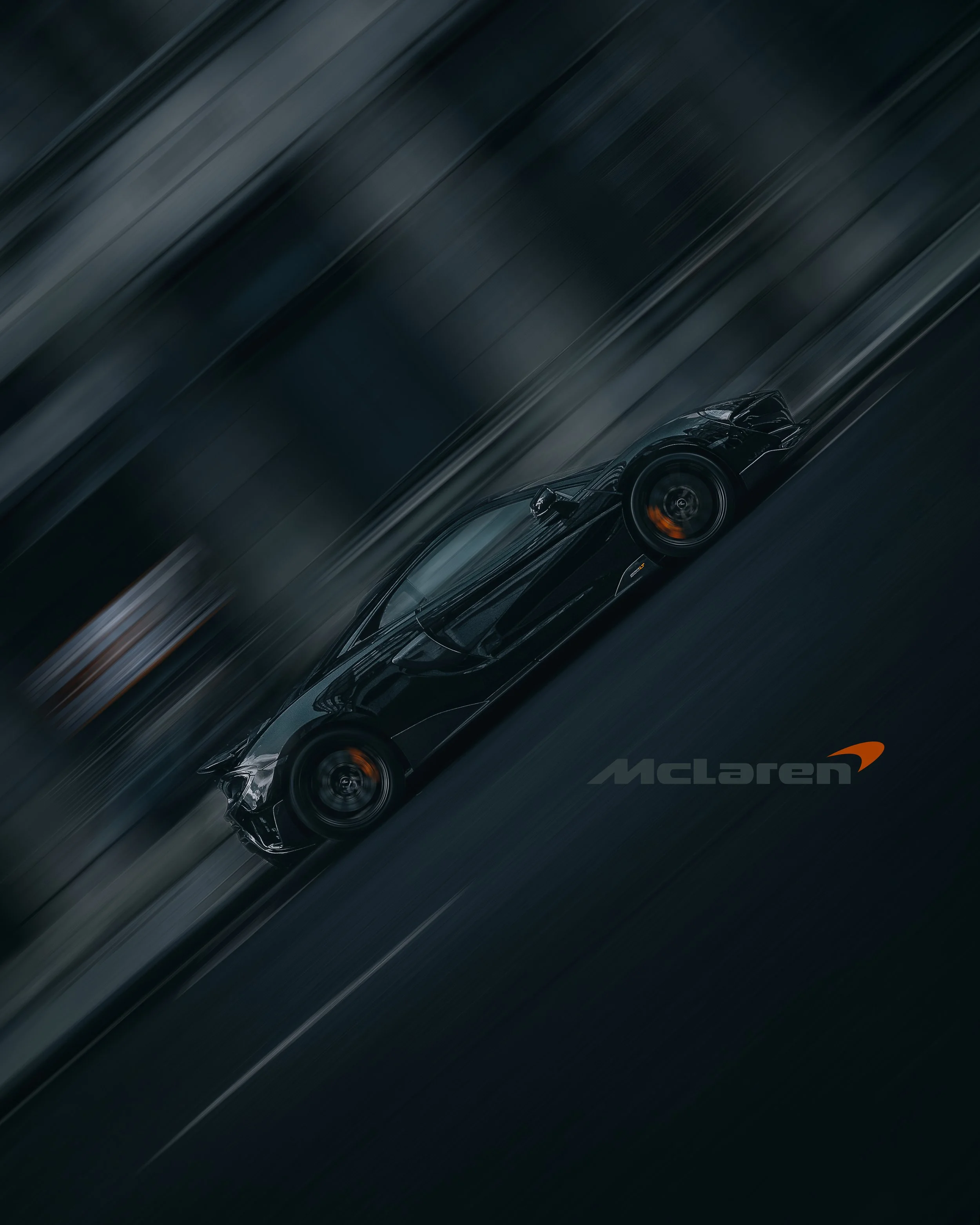
Another final look showing a cleaner composition with the text.